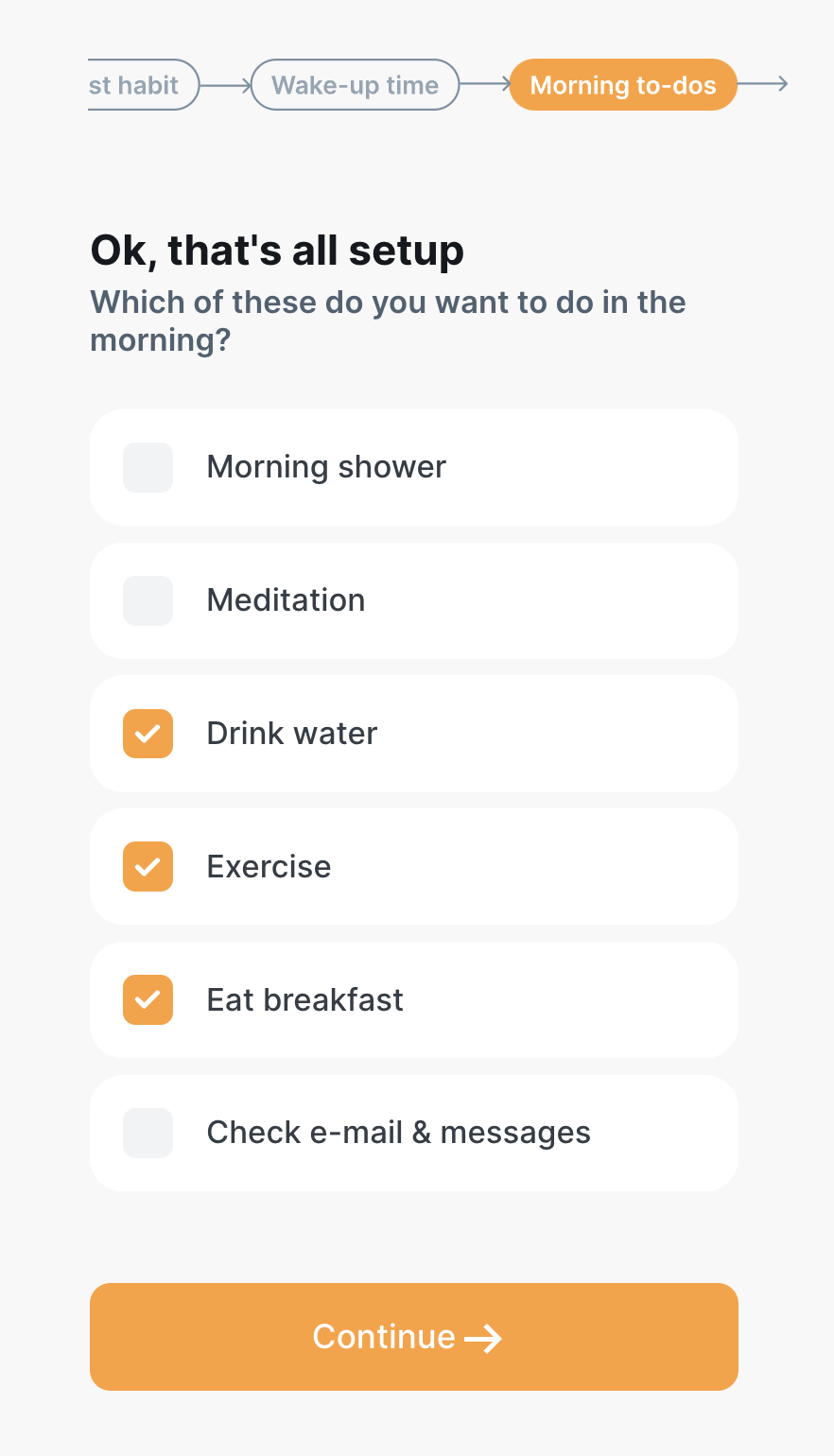
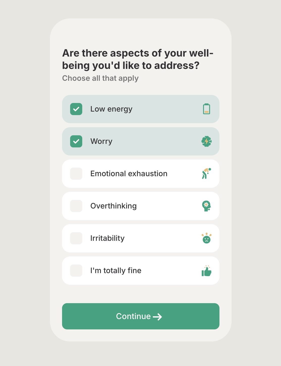
Goal Multi Choice
It must have choices and each choice must have a hoverBackgroundColor.
The choices of this step have three different states: not selected, hover, and selected. Each state needs a different design (colors and text colors).
The keys for these states are:
| Key | State | Notes |
|---|---|---|
type | goalMultiChoice | |
stepId | ||
title | ||
subtitle | ||
textColor | ||
backgroundColor | The step/screen’s bg color | |
innerBackgroundColor | Adds an inner background to the step similar to the screenshot in the note below | |
ctaText | e.g. Continue | |
ctaColor | The cta text color | |
ctaBackgroundColor | The cta background color | |
bottomButtonTextColor | bottomButtonTextColor, bottomViewColor, and bottomButtonColor are used when we want to give the cta a different style with a bottomView container. Note: This design is only for mobile devices. Tablets and desktops take the design from ctaColor and ctaBackgroundColor. "bottomButtonTextColor": "#00A37F", "bottomViewColor": "#00A37F", "bottomButtonColor": "white", 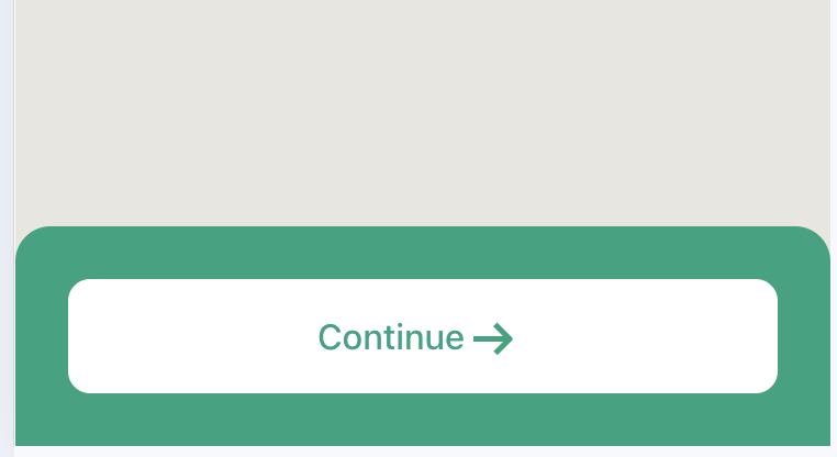 | |
bottomViewColor | The cta container background color on mobile devices. | |
bottomButtonColor | The background color of the cta button on mobile devices. | |
choiceBackgroundColor | normal | background color of the choice |
choiceTextColor | normal | text color of the choice |
hoverBackgroundColor | hover | background color of the choice |
selectedChoiceBackgroundColor | selected | background color of the choice |
selectedChoiceTextColor | selected | text color of the choice |
checkboxBackgroundColor | normal | background color of the checkbox |
selectedCheckboxBackgroundColor | selected | the background color of checkbox |
selectedCheckboxMarkColor | selected | Optional - the color of the checkmark when it’s selected. |
selectMode | single | multiple |
progressImage | An optional image to show a progress bar for the current multi-choice steps. https://c.thefab.co/web-onboarding/fabulous/splash/flowchart/progress-bar-beige-3.svg | |
hideProgressBar | Boolean. It can be used to hide the progress if needed. | |
backgroundImage | Step’s background image on Mobile - optional | |
desktopBackground | Step’s background image on Desktop - optional | |
riveOverlay | check [Rive Intro Overlay](Components/Rive Intro Overlay) for more info |
[!IMPORTANT] Note:
The choices accept
iconUrlto add small icons to the choice.
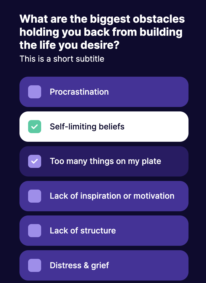
Example of a multi-choice step
 {
    "stepId": "biggest_obstacles",
    "key": "joyful_happy",
    "type": "goalMultiChoice",
    "title": "What are the biggest obstacles holding you back from building the life you desire?",
    "subtitle": "This is a short subtitle",
    "backgroundColor": "#0E0B2F",
    "ctaBackgroundColor": "#00CC9F",
    "ctaColor": "#fff",
    "textColor": "#fff",
    "ctaText": "Continue",
    "choiceBackgroundColor": "#47329C",
    "choiceTextColor": "#fff",
    "hoverBackgroundColor": "#2A1B66",
    "hoverTextColor": "#fff",
    "selectedChoiceBackgroundColor": "#fff",
    "selectedChoiceTextColor": "#0E0B2F",
    "checkboxBackgroundColor": "#A18DF0",
    "selectedCheckboxBackgroundColor": "#00CC9F",
    "bottomViewColor": "#4C3DC0",
    "bottomButtonTextColor": "#0E0B2F",
    "bottomButtonColor": "#fff",
    "choices": [
        {
            "value": "procrastination",
            "name": "Procrastination"
        },
        {
            "value": "self_limiting_beliefs",
            "name": "Self-limiting beliefs"
        },
        {
            "value": "Too many things on my plate",
            "name": "Too many things on my plate"
        },
        {
            "value": "Lack of inspiration or motivation",
            "name": "Lack of inspiration or motivation"
        },
        {
            "value": "Lack of structure",
            "name": "Lack of structure"
        },
        {
            "value": "Distress & grief",
            "name": "Distress & grief"
        },
        {
            "value": "Imposter syndrome, Not-feeling enough",
            "name": "Imposter syndrome, Not-feeling enough"
        },
        {
            "value": "I want everything to be perfect",
            "name": "I want everything to be perfect"
        },
        {
            "value": "Lack of self-discipline",
            "name": "Lack of self-discipline"
        },
        {
            "value": "Distractions",
            "name": "Distractions"
        }
    ]
        },
An example of a progress bar at the top of the step: